A landing page for each segment rather than one for everybody
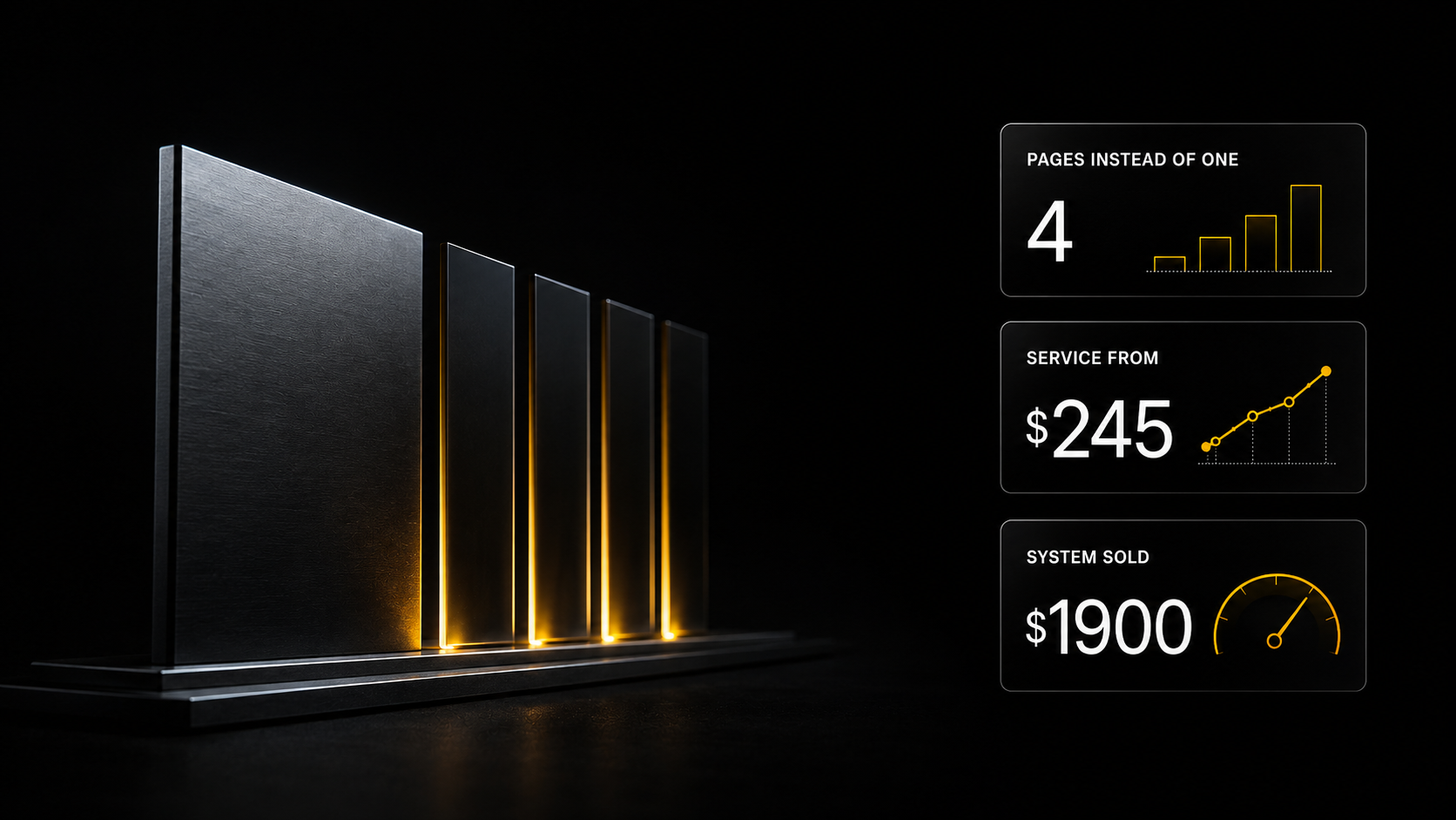
A universal page addresses an average person who does not exist, and so convinces nobody. Below is the structure of a narrow landing page block by block, what in it drives conversion, and how to build four pages instead of one in the same time.
A universal page addresses an average person who does not exist, and so convinces nobody. Below is the structure of a narrow landing page block by block, what in it drives conversion, and how to build four pages instead of one in the same time.
---
The page exists and the enquiries do not
The landing page got made. The design is decent, the copy is written, the button is in place. Traffic arrives. Enquiries are few or none.
Then people start fixing the wrong things: changing the button colour, rewriting the headline, adding testimonials. Sometimes that helps by a few per cent, but the problem is usually elsewhere.
The problem is that the page was written for everybody at once. And "everybody at once" is not a person. Each individual visitor arrives with their own problem, and on a general page they do not find themselves: half the text is about other people's problems and their own is mentioned in one line.
Why a universal page loses
The root cause: trying to cover everybody produces text that catches nobody.
When you write for four different types of client simultaneously you are forced to generalise. Generalisation sounds like "a comprehensive solution for your business" — a phrase behind which nobody sees their own situation.
A narrow page does the opposite: it narrows and lands. Somebody reads the first screen and understands it was written about them specifically.
The misconception: "a narrow page cuts off part of the audience". It does — and that is its job. The people cut off were not buying anyway: they left the general page silently and you simply did not see it.
A second misconception: "four pages is four times the work". No. The skeleton is one; what changes is the first screen, the statement of the problem, the examples and the call to action. Most of it is reused.
And a systemic layer. A landing page is not standalone work. It is assembled from the segmentation and the positioning. Without them it gets written on inspiration, and it will have to be redone whole.
The structure that works
The order of the blocks is not accidental: it follows the train of thought of somebody reading.
1. The first screen — recognition. Not "who we are" but whose problem this is and what the person gets. There is one job: within three seconds the visitor understands they came to the right place. Specifics belong here too: timescale, scope, format.
2. The problem in the client's words. A verbatim phrasing from the audience research. Not "many people struggle with promotion" but the sentence the person said themselves. That is where trust appears — before you have proved anything.
3. Why the usual solution does not work. An explanation of the mechanism rather than scaremongering. This is the block that distinguishes you from competitors more than any list of advantages.
4. The solution and how it is built. Stages, timescales, what happens at each. The person should see a process rather than a promise.
5. What they end up holding. A list of artefacts rather than benefits. "Positioning, a month's content plan, a landing page structure, two sales scripts" is verifiable. "Increased recognition" is not.
6. Proof. A case with figures, work you can look at. One real piece of proof outweighs ten testimonials saying "we liked everything".
7. The price and what makes it up. Not one sum but a composition. A quote of six lines defends itself: people argue with the items, not the total.
8. Answers to objections. The ones that actually get said, verbatim. "I could put this together myself in an evening", "what if it doesn't work", "why so expensive".
9. One call to action. Not three buttons with different actions. One clear next step.
What changes from segment to segment
The skeleton is one. Four things change, and that is enough.
The first screen. To a local business owner — "people are searching for you and finding a competitor". To an expert preparing a launch — "a page by the date so the advertising does not stall". To somebody testing an idea — "a week, and you see the figures".
The statement of the problem. Each segment has its own, and it is already written down in the research — verbatim.
Examples and proof. Show work done for a similar client rather than your prettiest.
The call to action. Different stages of readiness need different actions: one gets an analysis, another a quote, a third the terms directly.
The remaining blocks — how the work is built, what the result consists of, the price — are reused almost unchanged.
What kills conversion most often
Five things found on almost every page that does not work.
An "about us" block as the second screen. The person has not yet understood why they need you and you are already telling the company's history. That block is needed, but nearer the end.
Benefits instead of artefacts. "We will raise your recognition", "we will take you to a new level" — that is nothing. A person can neither verify the promise nor judge it.
Testimonials with no specifics. "Liked everything, recommended" does nothing at all. What works is a testimonial naming the task, the timescale and the result.
Several different calls to action. Download, subscribe, order, write — all on one page. Somebody offered four actions takes none.
An eight-field form. Every extra field costs enquiries. A name and one way to reach them is enough; ask the rest in conversation.
How to check a finished page
Three checks, a minute each.
The first-screen check. Cover everything except the top block and show it to somebody from your target group. Ask: who is this for and what is being offered? No answer within ten seconds means the first screen does not work.
The competitor check. Replace your name with a competitor's. If the text is still true, you described the industry rather than yourself.
The artefact check. Count how many verifiable promises the page contains and how many benefits with no substance. If the second group is larger, the page sells nothing, it praises.
How many pages to make at the start
Not four at once. The order is this.
The first page — for the dominant segment. The one the research showed to be largest. If one segment gives more than half the audience, the rest can wait.
The second — for the most solvent one, even if it is smaller. Often those are different segments, and the second page pays back faster than the first.
The rest — as traffic arrives. Making a page for a segment nobody comes from yet is work for the drawer.
And a general rule: one working page beats four half-finished ones. The skeleton is reused, but the first screen, the problem and the proof require genuine work per segment rather than swapping two words.
What the business ends up with
- A structure per segment — as many pages as there are segments
- Copy built on the audience's verbatim phrasings
- A list of artefacts instead of a list of benefits
- A quote as a composition, not a single figure
- An objections block built from real ones rather than invented
- A built page
By the methodology I use, the websites and landing pages stage sits inside monetisation — 3–4 days together with the product line. Part of the full positioning package: 3–4 weeks, 25–35 hours, around $1 900. Honestly: that is the price of the service by our methodology, not market statistics.
Separately, if the market side is of interest: by my scrape of 848 listings a commissioned multi-page website runs $245–730, and MVPs and systems $490–1 460. Those are market observations and must not be mixed with the price of the methodology.
Do it yourself or commission it
Do it yourself. The mechanics above are the "Websites and landing pages" block from "Freelance 2.0": developing a landing page structure for a product, and building it. Both take the segmentation, positioning and product line as input — which is why they need no inspiration.
The course costs $9 and is included in Basic. Registration is free and opens three days of full Basic access — plus 140+ AI assistants across 14 categories and the ten-lesson sales module. Website templates with result previews are available on the Plus plan.
Commission it. The service exists. The sign it is being done wrong: if a contractor starts with design rather than with the question "who are your segments and what do they say", you will get an attractive page with no enquiries.
Do one thing today: open your landing page and apply the competitor check. Put somebody else's name in place of yours. If the text does not break, you have found why the page does not sell.
---
How this looks on a real project
What follows is the same work on a live client. Fomin Studio, "the Fomin Method": two doctors, Zakhar and Alexandra, husband and wife. The work was delivered as eleven sections, the ninth being websites and landing pages.
Why this example is here. It shows that a positioning package is not an abstraction but a service with a clear composition. And it sells to any business that has an audience and a product: a clinic, a school, an agency, a shop. The mechanics are the same; the contents change.
An analysis of that deal from the first message to the payment is included in the sales module on the Basic plan.
One route to a booking
Social media brings people in; what turns them into a booking is a chain of pages. The scheme: traffic → the hub sorts by pain → a segment page closes → the bot qualifies → a booking.
The general landing page is a router, not a salesperson
It does not sell a procedure. It sorts people into three paths by their pain, right on the first screen, with the question "what brings you here":
"I'm afraid of treatment" → the anxious · "It hurts and I don't know where" → the functional · "I want a nice smile" → the aesthetically driven.
The main promise is one: we find the cause, we do even the complex work without pain, and we tell you honestly what is needed.
Three segment landing pages
Each pain has its own page with its own first screen and its own angle. The example for the priority segment: "I was terrified — and I didn't feel the injection" instead of a general "painless treatment".
The location split is handled by the bot, not the landing page
A subtlety usually handled wrongly: the page shows both routes, and who is where gets sorted out by the bot — by city and willingness to travel.
Local — an in-person consultation with the diagnostics free, the same for all three segments. Out of town — different by segment: lead magnets and a discount, an online analysis of the cause, a plan reviewed online.
A running frame of honesty across all four pages
We do not promise an outcome — we promise a cause and a plan · connections are presented as an observation rather than a promise · plain speaking about approaches, not about brands · anything acute goes straight to an in-person doctor · online is a second opinion, not a diagnosis · no pressure: no invented deadlines.
And on before-and-after photographs: we improve the presentation, not the result.
---
What to read next
[Audience segmentation as a service](/en/blog/audience-segmentation-service) — where the segments come from.
[A 30 000-character brief](/en/blog/prompt-30000-characters) — why "build me a landing page" produces a mediocre result.
[Look first, generate second](/en/blog/preview-before-generate) — how to choose a template by result.
[A product line](/en/blog/product-line-from-content) — what goes on these pages.
[Skills for Claude Code](/en/blog/claude-code-skills-guide) — the full guide to skills.